

Video of the talk…
Opening video: Abridged version of Your very good health, Public info film (NHS) 1948

I wanted you to see that film – 70 years old this year – because its promise, of universal healthcare, free at the point of need, is as relevant today as in 1948. But much has changed in that time. 97% of people born in Britain since 5th July 1948 – myself included – have been born in the NHS. The cartoon baby at the end of that film is now himself a cartoon pensioner. He is living a longer, healthier life than his cartoon parents. Meanwhile medicine is transformed. We’re on the cusp of another revolution in genomics and personalised medicine.
I work for an organisation called NHS Digital. We’re the national provider of data and technology services for health and social care.
Our users are:
- 53 million patients and the public across England
- 1.3 million health and care professionals
We support:
- the scientific research community who use NHS-scale data for research, and
- the service community – the people who work every day to keep the health and care service functioning, and to make it more efficient.
As head of design, I’m privileged to work with a great team of designers, user researchers and others who together are designing and delivering some vital tools and services in support of that vision. I want to tell you about that design capability. I want to show you some of the things we’re making. And I want to think about the future of health and care, and how design has a vital role to play in realising its promise.
Design capability
Let’s start with the design capability we’re building. Around 40 designers work on services used by patients and professionals across the complex health and care ecosystem. There are a few services – like the national NHS website – that we design and build as national solutions from the ground up. But for many others, the digital bit we deliver nationally is just a small part of someone else’s end-to-end service, including elements bought and built locally by NHS organisations or third-party suppliers.
The make-up of our design team reflects this:
- 23 interaction designers
- 10 service designers
- 5 graphic designers
We have interaction designers working directly on the digital services we deliver ourselves. They also need a graphic design sensibility, because we’re working with one of the UK’s most trusted brands, the blue lozenge. Above this, we’re building our service design capability, to be able to design health and care services, as Lou Downe at GDS says, from end-to-end and front-to-back.
It won’t come as a surprise to anyone who knows UK government design practices that our designers work in agile, multidisciplinary teams, along with product managers, user researchers, developers and other specialist roles.
Working at health service scale gives our designers another responsibility – to talk to each other – individuals and interactions over processes and tools. As the team grows, we’re also investing in design leadership capability – to have a mix of experience and seniority, a career path, and job descriptions. I might be the only person in the team who’s excited about this, but we recently got organisational sign-off for a complete set of designer job descriptions on the same NHS pay scales as nurses, pharmacists, and managers.
When I’m explaining what we do to non-designers – and, believe me, I spend a lot of time doing that – I always fall back on Jared Spool’s wonderfully economical definition of design as “the rendering of intent.” Intent without rendering gives us a strategy but cannot make it real. Rendering without intent may be fun – may even be fine art – but is, by definition, ineffective. Every one of our designers must be able to explain the intent behind their work.
Because in health and care, intent is varied and complex. User needs for health and care services come in at least three flavours:

- There are clinical needs – people expect the services we offer, and the tools we recommend, to be clinically safe and effective. But that alone is not enough.
- To be adopted and used, services must meet people’s practical needs in the context of their lives. If that context is mobile, the service must be designed mobile first. If it’s to be used in the middle of the night, it needs to connect to services that are open.
- Finally, it’s as important to meet our users’ emotional needs. Sometimes people go to the doctor not just for information, but for reassurance. Information could be clinically accurate, but if it doesn’t connect emotionally, the user need has not been met.
Every designer in the NHS needs intelligence and empathy. They must understand the true intent behind their services, reconciling diverse clinical, practical and emotional needs.
Too easily, people become disempowered by worry, illness, disability, or social circumstances, and (even though we don’t mean to) by the way we have designed and delivered NHS services in the past.
So we need to design for the positive role of patients and carers, to think about their assets – what they have and can do already – as well as their needs and deficits. We need to co-design with patients, staff, family carers and voluntary sector who all make up our service community.
Finally we need a continual focus on digital inclusion and accessibility, because the NHS is for everyone, and those with the greatest health needs are also the most at risk of being left behind digitally.

This is Hastings, where our partners on the NHS Widening Digital Participation programme have been developing models of digital health interventions for people who are homeless or at risk of homelessness.
Show the things
For a long time, we had this quote on the wall by the team working on the NHS website redesign:
“It’s just a website, We’re not going to the moon.” Mikey Dickerson on fixing healthcare.gov
This summer, we transitioned the national NHS website to a new mobile-first, accessible platform. In 2018, this should be basic stuff really, but through a series of policy twists and turns, getting to this point was a big deal. We topped it off with a new name. In research, we asked people what they called it. And we used the words they used. So the site formerly known as NHS Choices is now simply “The NHS website.”

It’s just a website – with more than 48 million visits per month. That’s a quarter of all health-related web traffic in the UK. People expect a different relationship with healthcare, as well as different channels to access it.
There’s good evidence that people in control of their own health and care get better health outcomes. So while we’re here as the NHS for you in the times of greatest need, we also want to help you look after your own health and wellbeing even when you’re feeling fine.
The NHS website has to be there for users in many contexts, needs and emotional states. We have to design for the end-to-end user journey – whether a short, acute, episode of care, or management of a long-term health condition. Making the whole journey visible to everyone involved is powerful, because otherwise no one professional or organisation ever sees the whole picture.

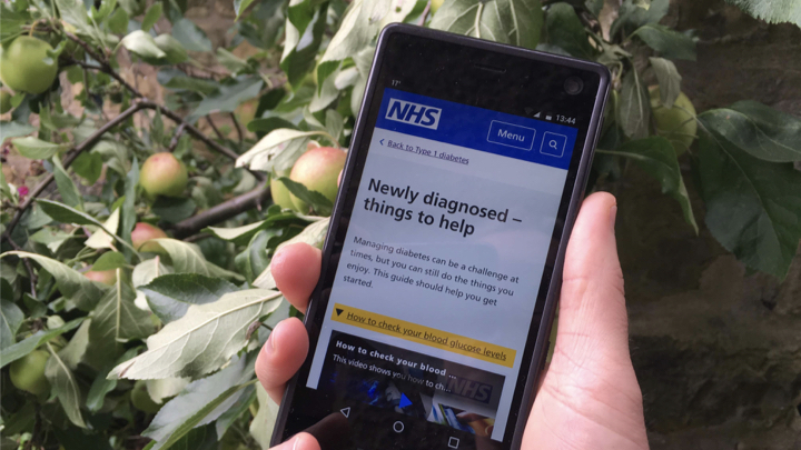
One team looked deeply at the experience of people with Type 1 Diabetes. They mapped a whole journey from someone not even knowing they have a problem, through the trigger that leads to diagnosis, getting to grips with a potentially lifelong condition, and over time confidently managing their wellbeing. They found – and this has echoes in other conditions too – that the point at which the NHS website could help most is the first weeks and months after diagnosis.

Another team has taken the triage pathways that underpin the 111 non-emergency phone service and turned them into an online service. The online service is designed to get people to the help they need while taking pressure off the telephone service. But the big picture here is important, if we get it wrong, we could send worried well people in greater numbers to accident and emergency departments.
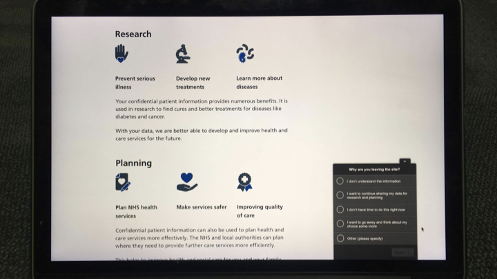
Confidentiality, trust and consent are big, complex issues we have to navigate. We have to understand them when delivering a simple, secure way for people to log in to NHS services. And we’re giving every patient control over how their data can be used beyond their own direct care.
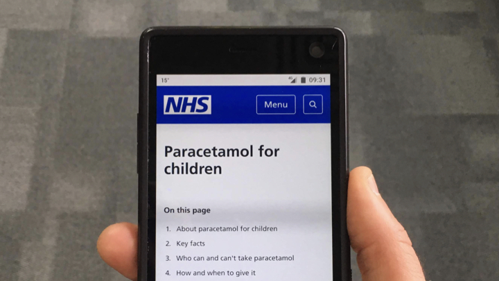
Design doesn’t stop at the big picture. We also have to care about the details. Here, for example, is a page on the old NHS Choices website about paracetamol. The information on the old website was clinically safe and accurate. You’d expect nothing less of the NHS. But, in research, one group in particular – parents with young children – told us the way it mixed information about adults and children was disconcerting. They worried about accidentally giving an adult dose to their child. So we’re splitting the page in two – one about paracetamol for children, another about paracetamol for adults. That way we can meet not only the clinical need, but our users’ practical and emotional needs as well.
We had to diverge before we could converge on a single set of styles. When I joined the team a bit more than a year ago, everyone was telling me we had to deal with the inconsistent styles that were springing up in different teams. But I worried we were in danger of getting stuck too soon at a “local maximum”, super-optimising the first designs the NHS alpha team had come up with. So I made myself unpopular by telling designers to spend a bit longer solving their own problems, designing solutions in response to user needs.

When we did come to converge, through a process of patient design diplomacy by Dean, our lead designer, I believe the results were stronger for this extra round of divergence.
While we’re getting our own house in order, developing a consistent set of styles and design principles for the nationally-delivered NHS services, patients the public, and professionals experience a patchwork of interactions commissioned and delivered in many different ways across the wider NHS family. We want to make experiences consistent, no matter whether you’re using the national website, or a condition-specific app, or a service built by one of your local NHS organisations.

So we’re publishing our user-centred design standards, patterns and practices in a new NHS digital service manual. We’re working across the system to do this, and combining good public sector practice, such as the GDS design principles, with the things that make the NHS unique. The service manual team had hoped for a soft launch, but the beta has already been well-received, and I reckon we’re going to speed up this work in the near future.
Aside from the NHS website, we’ve had a team building a beta version of a new NHS app.
Design for the future
What role might human-centred design play in realising the promise of new medicine and technology? Look at the amazing trajectory of human understanding of DNA, RNA, enzymes, proteins, the genome, and the mechanisms by which they interact. This stuff will transform – is already transforming – our relationships with medicine. Crucially this generation of scientists are looking inside a black box, where their predecessors could observe its effects but not its inner workings.

At the same time, fuelled by petabytes of readily available data to digest, computer science risks going the other way in the framing of artificial intelligences: moving from explicable, simple systems to ones where it’s allowed to say, “this stuff is so complex that we don’t know how it works. You have to take it on trust.”
When we apply artificial intelligence (AI) to healthcare, transparency is essential; black boxes must be considered harmful. It’s not just me saying this. Here are the words of the Institute of Electrical and Electronics Engineers (IEEE):
“Software engineers should employ black-box software services or components only with extraordinary caution and ethical care, as they tend to produce results that cannot be fully inspected, validated or justified by ordinary means, and thus increase the risk of undetected or unforeseen errors, biases and harms.” — Ethics of Autonomous & Intelligent Systems
Transparency must be the order of the day. It comes in (at least) two flavours: the first is clear intent; the second, understandable operation. Both are under threat, and designers have a vital role to play in saving them.
When any technology moves from pure to applied science, intent must be centre stage. If we fixate too much on the computer science of AI, and not enough on the context of its application, intent will always be unintentionally obscured.
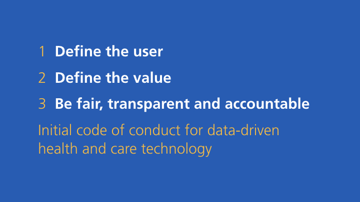
Many discussions about the “ethics” of AI or genomics are really, I think, discussions about the opacity of intent. If we don’t know who’s setting the goals for the machine, or how those goals are derived, how can we know if the intent is good or bad? For health and care, we have a new code of conduct intended to make sure this doesn’t happen.
In the words of Professor Margaret Boden, “the computer couldn’t care less.” She says:
“…computers don’t have goals of their own. The fact that a computer is following any goals at all can always be explained with reference to the goals of some human agent. (That’s why responsibility for the actions of AI systems lies with their users, manufacturers and/or retailers – not with the systems themselves.)” — Robot says: Whatever
It’s time for designers to double down on intent – true human intent that can be difficult to encode. In a domain as complex as health and care, intent is rarely straightforward. It can be changing, conflicting and challenging to untangle:
- a boy was triaged on first contact as in less urgent need, but has suddenly taken a turn for the worse
- an elderly woman wants to get home from hospital, but her doctors need first to be sure she’ll be safe there
- the parents want to help their children lose weight, but know that pester power always leads them back to the burger chain.
User-centred design must clarify who the service is for, what problem they’re trying to solve, and what benefits we expect them to realise.

It’s time for designers to double down on intent, and – let’s be honest – this is not an area where design has always covered itself in glory. We know what design without intent looks like, right? It’s an endless scroll of screenshots presented without context – the Dribbblisation of design. If you think that was bad, just wait for the Dribbblisation of AI. Or the Dribbblisation of genomics.
Thoughtful designers on the other hand can bust their way out of any black box. Even if they’re only called in to work on a small part of a process, they make it their business to understand the situation holistically, from the user’s point of view, and that of the organisation.
Experienced designers are confident moving up and down the stack – through graphic design, interaction design and service design problem spaces. Should we point an AI agent at optimising the colour of the “book now” buttons? Or address the capacity bottlenecks in our systems that make appointments hard to find?
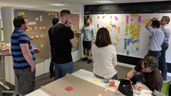
One of my team recently talked me through a massive service map they had on their wall. We discussed the complexity in the back-end processes, the push and pull of factors that affected the system. Then, pointing at a particular step of the process: “That’s the point where we could use machine learning, to help clinicians be confident they’re making a good recommendation.” Only by framing the whole service, could they narrow in on a goal that had value to users and could be usefully delegated to AI.
Designers are well placed to show the workings of their own (and others’) processes, in a way that proponents of black box AI never will. This is my second flavour of transparency, explainability, clarity of operation. Show what type of algorithm you are building, why that algorithm, how you check if it’s working the way you intended.
How might we:
- communicate probabilities and uncertainties to help someone decide what to do about their disposition to a form of cancer?
- show someone exactly how their personal data can be used in research to develop a new treatment?
- involve people waiting for treatment in the co-design of a fair process for prioritisation?
In a world of risks and probabilities, not black and white answers, we should look for design patterns and affordances that support people’s understanding and help them take real, fully informed, control of the technologies on offer. This is not an optional extra. It’s a vital part of the bond of trust on which our public service depends.

The cultural ascendancy of AI poses both a threat and an opportunity to human-centred design. It moves computers into territory where designers should already be strong: exploration and iteration. I’m critically optimistic because many features of AI processes look uncannily like a repackaging of classic design technique. These are designerly machines.
- Finding patterns in a mass of messy data?
- Learning from experiments over many iterations?
- Sifting competing options according to emerging heuristics?
User-centred design does all those things too.


Some diagrams explaining AI processes even resemble mangled re-imaginings of the divergent/convergent pattern in the Design Council’s famous double diamond. The threat is that black box AI methods are seen as a substitute for intentional design processes. I’ve heard it suggested that AI could be used to help people navigate a complex website. But if the site’s underlying information architecture is broken, then an intelligent agent will surely just learn the experience of being lost. (Repeat after me: “No AI until we’ve fixed the IA!”)
Designers should embrace the new, more design-like metaphors of rendering intent. As a profession, we have a great story to tell. We should talk more about our processes for discovering and framing problems, generating possible solutions and whittling them down with prototypes and iteration. Sure, we’ll need new skills, to change and evolve our methods – we’ve already mastered web, mobile, assistive tech. As Ursula le Guin wrote:
That’s the neat thing about technologies. They’re what we can learn to do.

As the title of Ellen Broad’s wonderful book has it, AI is ‘Made By Humans’. We can pair human intelligence with artificial intelligence, and harness the combined power of us all, through collective intelligence.
How might we give power to the communities of health and care (and help them understand each other better in the process)?
- Patient community – taking advantage of collective knowledge and data
- Clinical community – integrating machine learning into clinical practice
- Scientific community – extending existing modes of collaboration
- Service community – co-ordination problems and realtime system status
(Credit to Stefana Broadbent for framing the first three categories at a recent Nesta event on Collective Intelligence.)
Some people say that the pace of change in accelerating, and that big organisations like the NHS can never keep up. I don’t believe that. For 70 years, the NHS has known nothing but change. Back in 1948, Nye Bevan, the founder of the NHS said something remarkably prescient. I think this attitude is one of the reasons, against the odds, we’re still here as a 70-year-old institution today.
“We shall never have all we need. Expectations will always exceed capacity. The service must always be changing, growing and improving – it must always appear inadequate.” — Nye Bevan, 2 June 1948

2 thoughts on “The promise of understanding – a talk at Interact 2018”